Wednesday, October 20, 2010

Monochromatic Masterpiece
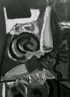

In this assignment, I could paint values with depth rather than worrying as much about color. The use of gray scale tones was used to ass different shades and accentuate certain areas. The original painting, which was of a still-life allowed me to add areas of lights to darks depending on where the light source hit. The upper left corner, which represents the lighting caused the left side of my depiction to be shades lighter than those of the right. To accentuate the table, value was added the the items on the table to show that they were made to stand out. Overall, this assignment left room for options in how the approach taken to create a solid piece.

Distortion


Monochromatic Masterpiece


Being able to use a wide value range allows you to really get into the picture. Your image will have more detail and depth, and it will probably be easier to decipher what is actually there.  A narrow value range is good because it can simplify images that have too much going on. In my design, a narrow value range works fine, because the piece is not complicated and is sort of, smoothed together.

Rectangle Harmony & Object Distortion


Monochromatic Masterpiece


The advantage of a wide value range is most definitely the use of depth. By having a scale of different values, the painting can become more complex and realistic, illustrating the range of highlights and shadows. However, if there is a narrow value range, it would be more difficult to portray detail. Because this masterpiece is so complex, a narrow range would not benefit the painting. In my design, I personally like a wide range of values for the purpose of perspective. It distinguishes the foreground from the background and highlights the detail. If I inverted my values in my painting, the painting would be very light and not as much as a strong contrast. It would look rather washed out as well.

Rectangle Harmony and Object Distortion


Tuesday, October 19, 2010

Monochromatic Masterpiece

This assignment I enjoyed a lot. In my achromatic masterpiece I feel I used a wide value range. There were many different values used throughout, however there were some consistent values as well. In the face of the picture this is where the wide value range is most noticeable. This technique was used to bring out the facial features of the person. I feel that this works the best in my design and helps bring out the great detail in the person.

By:Tim Thompson

Rectangle Harmony and Object Distortion


By: Tim Thompson

Asymmetrical Balance of 5 shapes


By: Tim Thompson


Monochromatic Masterpiece


The advantage of a wide value range would make the picture easier on the eye and create a feeling of softness and smoothness. The colors would blend more. This type of value range would be best with landscapes, the ocean, and the sky. The advantage of a narrow value range is that you can choose white, a light shade of grey, a medium, a very dark, and then black. This would enable the picture to be more vivid and sharp. In my design, it is very clear that a narrow range of values is ideal. The original piece of art is very vivid, hence why I outlined everything in black paint to show the borders and outlines between the figures. It is very easy to see the objects. If I inverted the values, the picture would have a very different feel, since the main objects are in darker paint. I think the painting would lose the sharpness that is created by using darker shades. However, it would be very interesting to see what the painting would look like with black sheets and very light people/animals.

Rectangle Harmony and Object Distortion


5 Shapes


Light


The advantages of a wide value range are that it would show more contrast between the places that are supposed to be the lightest and the darkest. The advantages of a narrow value range are that it's soft and pleasing to the eye - not harsh. I think that the contrast works in my favor because of the difference between the water and sky.

Harmony and Distortion


rectangle harmony and object ditortion

Monochromatic Masterpiece

Original 

Values Inverted in Photoshop

The advantage to a wide value range would allow you to show more shadows and allow you to get more depth in an image.  The advantages for a narrow value range is that you can create a simpler image that looks just as good as an image with alot of values.  Usually the simpler the better.  Why? Well when an image is simple, the overall effect is classier and cleaner.  When I inverted my image I thought I would get darker colors but to my surprise I got lighter colors and got my image to look like a ghost!  If I had to choose I like my original image.  My only thoughts on my image is that I feel that I should have taken out the shadow on her cheek on her left cheek because her face looks darker

Five Abstract Object Harmony

Leaf in Village

Object Distortion


I never took a picture of my boxes but I had two black boxes and two gray boxes and then a skinny white box in the center of the paper. I was deciding between a lightbulb and a leaf at the beginning, but decided to do the leaf because I felt it was more interesting and would stay away from being to cliche (lightbulb = design thinking). The top image is the leaf I found in Village and the second image is my final result. I first designed the leaf on the bottom right hand corner.  To get the detail of the leaf but also keep it simple I made black lines.  I then made the two leaf distortion on the bottom left gray rectangle.  I wanted the outlines of the black to create the leaf.  I  then made the top left leaf in the black rectangle.  To keep balance I decided to use gray because I felt white was so strong on the black that my starting leaf was strong enough to balance white in the final outcome.  I then made the middle white rectangle leaf.  I got the idea from Prof Buening to make the leaf look like its bending or folding in a DNA strand look.  I then finished this piece by making the top right leaf.  This one I tried to make the background make the image like in the last project (making paths and finding balance between white and black). 

Asymmetrical Balance of 5 Shapes


Wednesday, October 6, 2010

5 shapes


Tuesday, October 5, 2010

5 Shapes


Rhythm


black and white spaces

lines

first one
mood: confused


second one
mood: energy


third one
mood: calm


fourth one
mood: bored


revised one
mood: excited

Which one did you revise? Why? (Pick the worst one)

The one I chose to revise/thought was the worst was the last one that combined all three types of lines. I felt it was the worst because it was kind of boring and there want much going on it. The center was mostly open and plain. I didn’t like that. The revised one has a lot more going on and has more of the different kinds of lines.

Group one: Revised piece and picture two: excited and energetic

Group two: pictures three and four: calm and bored


Monday, October 4, 2010

Black to White to Black/White