This image brings business to life! This links the companies through graphics and interesting organic shapes to emphasize the connection between the businesses. Also, I love the various type sizes because it puts attention on certain groups depending on their value. Also, the colors still utilize the business scheme and are not too overwhelming. Now, I feel I will pay more attention to information graphics because before I never analyzed them in a design aspect.
I chose this clip because as I remember from my childhood, Rugrats, had such interesting camera angles. The show portrayed the point of view from a baby. Not only was the show focused on the babies, but also the composition. The directors clearly emphasized a "child's point of view." The composition in each scene is intriguing to the eye because it is as if you are looking through Tommy's eyes. We see his parents at an angle from the floor as well as the clumsiness of a baby trying to walk. This trailer for the movie truly incorporates the perspective and composition through the eyes of a baby. I love that a childhood show can express such beautiful transitions and composition.
Here is the link for the video...It would not let me embed it :(
I chose this graphic because I just took a nutrition course and discussed fast food frequently. Also, as a business major, we use graphs a lot to convey information and show differences. This is a information graphic on the amount of sales per year in the fast food industry. The person who made this graphic also compared it to Afghanistan's GDP, to further convey the message that we spend more on fast food then Afghanistan's GDP.
I would consider this a very clear information graphic because it clearly states the amount of sales in billions, and uses the size of the graphic as a "bar graph" to show the differences in sales.
This clip is a scene from How To Lose A Guy In Ten Days. The scene was about the couple fighting because they just found out about each others bets. They were singing to each other by changing the words and insulting each other. For the most part, the two characters were in the middle of the screen. However, while there was a shot of the female's boss, you can see the owner of the diamonds (whose party it was) in the background...which was a good use of negative space. It directed my eye from focusing in on the boss. Also, the owner of the diamonds had bright hair, which directed my eye further to her.. while still hearing what the boss was saying, even though I wasn't looking at her. There was another part of the clip I found interesting with positive and negative space. While the girl in the yellow dress was leaving, there was a shot of her walking away into the negative space, but then the next shot was of her from behind..so it was like a continuation. There were also parts where the couple was singing on the left hand side of the screen, while the man was playing piano on the right. This was good use of balance.
Balance: As I watch this clip, I notice that with every camera angle change, there's always a nice balance between where the characters are standing. The tall grass on either side of them also made the shots feel like they have a sturdy structure.
This is an information graphic called Similar Diversity which looks at the topics of religion and faith trough a visual involving the Holy Books of five world religions: Christianity, Islam, Hinduism, Buddhism, and Judaism. The basis of the design is an objective text analysis, and is done without any interpretations from the creator. This graphic conveys information by connecting characters in the five Holy Books with frequently used words. The arcs show similarities in activities between different characters. The different sizes and shades of gray used on these arcs shows the strength of the similarities between the characters. This image attracted me because it's interesting to look at. After reading about it, I want to see it in person so I can spend a lot of time looking at the crazy detail. You can't see it in the image, but there are numbers where the arcs intersect that show the strength of the correlation between the characters, calculated by and algorithm. Plus, the topic is so interesting. Religion and faith are the most controversial topics across the world, and an objective look at how all of those conflicting faiths are actually similar is just really beautiful.
I chose this video (because the tiny giraffe is so cute) and because the giraffe is scaled down from it's normal size. In the frames throughout the beginning you can see how the man owns all these amazing things and as he's talking the giraffe stays out of frame until the last scene, where we are allowed to see it.
This is a really cool information graphic because it plays off the well known table of periodic elements. In this graphic, it is showing all different websites, and the different categories that they belong to. Each family i sa different category, for example, all blogs are in one family. I was drawn to this because I'm a huge computer addict, and am constantly using the internet. They also made it colorful so that it is more pleasing to the eye.
In this video the creator uses color to abstract from the eye what is actually happening in the video. He uses the colors white and black to distract the eye as a moon walking bear dances through the picture. If following the white team passing the ball one forget to look at the black team, missing the bear. The unity of the white team takes away from the black team and as a result one misses the object. This video is pretty interesting.
This information graphic is interesting because it is an interesting design in which many newspapers don't embrace. This text graphic combination is a useful format when you need to present complex information. You can load this format with a lot of of information without it feeling overwhelming. This infographic is notable from an information design perspective as it mixes texts and graphics and uses time-shifting, focus, and abstraction to explain why Johan Santana's changeup is so effective.
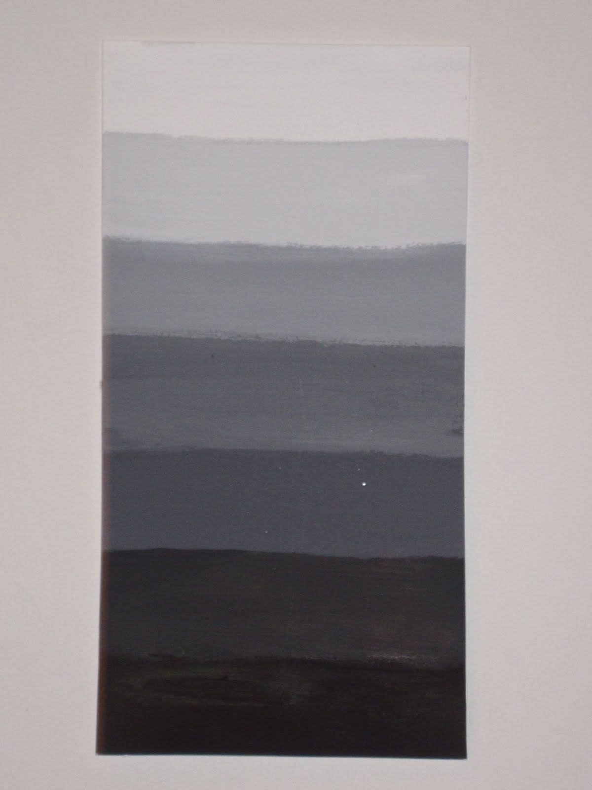
The advantage of having a wide value of range is that it allows your design to have more depth. For example, the more values you have to work with, the more freedom you have; however, if your limited to a narrow value range, you do not have this freedom. The advantages of having a narrow value range allows for a bolder, more focused image. I think my design works best with a wide value of range because there are many components to this piece such as the trees in the back, the people and the two people which appear closest. I think a wider value of range allows this particular design to view different parts from different distances. I think if my values were inverted, the images that appear to be in the background will no longer appear that way. I think it would look like all the elements are being viewed closer together whereas the current values allow you to see what is up close and what is in the distance.
Out of the four types of Line Compositions above, I think the last one is the weakest. This project was assigned to test our scaling and proportions skills. I think this image is weak because the proportions of the design do not create a balances composition. It also seams as though the diagonal lines are competing against each other.
The image below is my revision. My biggest challenge was making the images bold while eliminating the competing factor of the lines. I wanted to make my new image simple in the sense I feel I did just that.
The following is basically a clip that link everyday routine tasks to a larger scale. For example, in the video, a girl is getting ready in the morning and takes a shower. Following this is the plumbing system from the water that is used for her to shower and eventually progresses into an information graphic of how the water system works. Initially, when viewing this video considering this class, I automatically thought of Rythm. With the choice of music, the rythm of this video is ongoing at a relatively fast pace which is how the real world works. In addition, it corresponds to the rythm of an everyday routine. Rythm is essential in any design. It allows the work to have fluidity which is apparent in this video.
The following information graphic is very interesting. It is relaying the message that technology is taking over the world which is apparent because it is set up on a map. Veiwing the different social networks such as Facebook, Myspace and even Xanga to other sources of information like YouTube and Wikipedia considerably draws my attention. All these technical tools and networks are used on a daily basis for many people. It is a source of information that many depend on. These online communities encourage others to connect with others on a very llarge scale. The map is distributed by different online communites but is still linked to one map as is the technical engines that are offered to us.
In this video advertisement the director uses an enormous amount of balance to show the strength and power of the product they are advertising. In the commercial, the balance of people taking out the pepsi cokes at the same time, shows that this pepsi product must be something sacred or special, which will influence the viewers to go out and buy pepsi.
This Info graphic is a visual representation of the ways one can prevent global warming. I really found this info graphic attractive because of its design. It is appealing with its hand drawn pictures, and intense colors. Although the design is simple, it gives off all the information necessary in understanding the concept.
In this commercial, what I noticed first was the director really used the idea of balance. In almost every scene the hamsters were in the center of the window along with the car when it was being shown. This probably was because these were the two main things the director wanted the audience to pay attention to. After many shots of the hamsters being in the center there would be one or two shots of the hamster off to the side. Because my eye was used to the hamster at this point in the next shot it would immediately go to the hamster even when it was to the left. This is a good way to keep the audience on the topic being sold. The space was also used wisely and there was either always something happening within all the space or the scenery really went well with the figures moving (the car being displayed).
The advantage of a wide value range would be the ability to have many colors and the freedom of any color. In a picture with many colors you are more free with the emotion or vibe you are giving off as well as the realism. The advantages of a narrow value range would be more focus on the actual art aspect of the image and the direct idea of it not so much the added detail and juice. With this design the wide range value works best because of all the detail that was in the original picture. If I were to invert the values the opposite values would take place of what is there.
This info graphic illustrates who is immigrating to America and where they are coming from. I think because of the 3D nature this graphic is appealing. I also think the way the flag is positioned is visually appealing with the flags surrounding. Also the colors chosen and how they compliment the flags is definitely attractive. This graphic is easy to understand and appealing.
In this film Persepolis, it shows many different ways of animation and different techniques we have been learning about. The film is mostly in black and white because its a flashback set movie. But the white space being used throughout the film is great. They show one scene with the family going down stairs to be safe from bombs and they use the stairs to create shapes out of the white space. Also the people are sillouttes which makes them make shapes out of the white space. The film also use a great balance of whites, grays, and blacks. The film shows texture using these two colors and when we learned to use a balance of grey, white and black in our projects. This film also does the same idea. They make the main focus white, and then use the grays and blacks to show depth.
I found this info graphic very interesting and hilarious. This info graph represents all the companies that have hit bankrupt since the economic crash. I think its very appealing and very funny how they use the term sunk to the bottom in money by using ships to represent each company. Also the larger the ship the more bankrupt the company became. This graph is a great way to represent bankruptcy because its a simple idea and it gets the point across "how a powerful company can hit rock bottom, like the Titanc (a ship said to never sink because it was the largest ship and non-destructive ship built."
This information graphic features a more lighthearted and comedic approach. Highlighting New York based photographer Todd Selby, the purpose of "The Selby" is to capture interesting people in their creative spaces. With viewers asked to choose which route they'd take in various awkward and outlandish situations, it only lead to one question. How Selby Are You?
Film Shot: the conformist x kanye west "addiction"
This video features the 1970 film "The Conformist" covered by Kanye West's "Addiction." The video follows the main characters and several selected interactions throughout the film. The music brings depth to the silent storyline by adding imagination and creativity for the viewer. - Negative space is shown specifically through wideshots of the two interacting. However, most of the camera angles focus on facial expressions. For example, the video opens specifically with a wide angle shot and narrows in on the woman and man's distinctive expressions.
The following two clips: from the first and second Tron movies, are posted for a visual comparison. In the first clip, Tron lightcycle designer, Daniel Simon talks about the conceived look of the new film, plus there's a brief shot of the lightcycle in action at the end. The first clip is interesting from a design perspective because Simon discusses the abstract meaning behind the "face" of the lightcycle. Notice too, that in this remake of Tron, which comes out on Dec 17 (also my birthday) how spatial the lightcycle scene feels. As Simon says (smirk)... you can see the lightcycle from all angles, including the bottom.
The second clip is from the original Tron, which was produced by Walt Disney Films in 1982. I was eight years old and I remember having an asthma attack because I was so impressed; scared too if you must know.
Now the drama seems relatively mild in terms of space. Notice how aggressively flat the space feels. Then again, the conflation of the deeper spatial dimensional people within the flat, computer generated lightcycle graphics, could be said to create an almost violently dramatic textual contrast. Thus giving what were once cutting edge (but by contemporary standards relatively simple) graphics a near symbolic resonance of man versus machine. Check it out...
In this Alice in Wonderland clip at first she is really small and the rabbit takes up the negative space in the background. Then she grows and takes up most of the screen. There isnt much negative space behind her, but it is taken up by the wall and leaves. When it shows the queen the negative space behind her is taken up by the grass, bushes and crowd of people.
The advantages of a wide value range is that it makes a painting more realistic, and a sense of depth. A wide value ranges also make it easier to show contrast between colors and gives off a “theatrical” effect. The advantages of a narrow value range is that it can portray a calmer scene. It includes subtle effects and simplicity. A narrow value range gives of a quiet or meditative feeling. My work is best created with a wide value range in order to show the contrasts between colors. It is important for there to be extreme contrasts of color because it will make the shapes stand out enough to make it show that it in not just a shape but it is forming an actual picture like a person or a car.


 Out of the four types of Line Compositions above, I think the last one is the weakest. This project was assigned to test our scaling and proportions skills. I think this image is weak because the proportions of the design do not create a balances composition. It also seams as though the diagonal lines are competing against each other.


