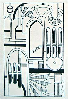
Example Project: Labyrinth


My intention: You can see that I got really into the idea of rooms here. The first image was inspired by MC Escher I attempted to build a labyrinth with many pathways while providing a variety of shapes to characterize each section. I inked the piece and put it away for a few days to get some distance from it.
Revision: After spending a few days away from the first design I realized it had become too cluttered. The line width was also too consistant and the image began to feel like a chore to look at. I wanted to give the maze clarity and a sense of fun.
In the second image about 25% of the lines are removed and the line density was altered in order to provide the eye with clusters of density rather than the continuous, all-over density of the first.
Overall, I am happier with the revised image but if I had more time I might alter the patterns to make the image more "Pop" like Roy Lichetenstein.
Labels: Labyrinth

1 Comments:
I like the revised version because in the first version I felt it was hard to pick out the shapes you were creating. Also the second version looks cleaner and looks like you put more attention to the details to each shape
Post a Comment
Subscribe to Post Comments [Atom]
<< Home